Shooting with REDCODE® enables non-destructive editing, which stores the post-production steps without modifying or requiring a duplicate copy of the original material making grading easier and fully reversible. In this article, we'll give an overview of non-destructive grading tools within the "Look: Image" and "Look: Curve" sections of the REDCINE-X PRO® side panel.

Move your mouse over the two buttons to directly compare the look before and after grading. Everything applied above is achievable using the tools in REDCINE-X discussed below, although artistic goals may vary.
Each of the subsequent sections discusses groups of tools with similar functionality. To watch many of these applied live in REDCINE-X, also see the overview of the REDCINE-X look panel video.
COLOR SPACE & GAMMA
These control how digital values get mapped over to actual colors and shades.

The color space specifies the range of possible colors, and gamma describes how a given numerical change in the file translates into a given brightness change in the image. These get the footage into a standardized and reasonably accurate starting point for subsequent grading.
In general, the color space and gamma should use the most up-to-date color science, such as REDgamma3 instead of REDgamma2, REDcolor4 instead of REDcolor3, and DRAGONcolor2 instead of DRAGONcolor. They aren't thereafter varied much, if ever. The one exception is with fully manual grading, in which case many prefer to set gamma to REDLogFilm (while keeping the color space at its most up-to-date setting), since this standardizes the tones and makes footage more receptive to a wide range of grading styles.
WHITE BALANCE, RGB SLIDERS & SATURATION
These affect the balance, purity and intensity of colors, and are useful for controlling color casts.


White balance helps ensure that neutrally shaded objects within the original scene appear neutral in the image. This often improves colors dramatically, and is required with virtually every shoot. The "Kelvin" slider adjusts the relative warmth or coolness, whereas the "tint" slider adjusts the magenta-green balance.
Most prefer to first change the Kelvin slider since this often needs more adjustment, then to fine-tune using the Tint slider. The "Pick WB" dropper tool can automatically estimate Kelvin and tint if clicked on a known light-shaded, neutral object. Alternatively, sometimes having technically accurate color isn't the goal. In these situations, white balance can also be used creatively to simulate late evening light (with a higher Kelvin value), or an overcast day (with a lower Kelvin value).


(more representative of original mood)
The RGB sliders affect color balance similar to the white balance controls, except the former uses three sliders whereas the latter is simplified to two. Having three sliders permits brightness adjustments if all are changed in unison, but this can also make it more difficult to adjust the color balance in isolation. The RGB tool is primarily for those that find it easier to think in terms of red, green and blue instead of warmth/coolness and magenta/green tint. Regardless, white balance should always be specified as intended first, since this ensures the most accurate colors; afterwards the color balance can be fine-tuned using the RGB sliders.

The saturation slider affects color intensity. This can make images more vivid and appealing, but can also exaggerate a color cast if the white balance isn't precisely neutral. Saturation can also be influenced by other settings, such as contrast and curves, so finalizing this slider is often saved for the last stages of grading. Some prefer to start with a small saturation increase of 1.1 or 1.2 when they start grading though, then to adjust this again later.
ISO, FLUT, BRIGHTNESS & EXPOSURE
These shift all tones brighter or darker, and are useful for fine-tuning exposure.


The ISO, FLUT and brightness settings all work much like ISO with traditional film and stills cameras, with one difference: they are designed to avoid highlight clipping and crushed shadows when increased or decreased as long as these were not present in the original capture. Each has an identical effect on the image; they're just expressed using different units, and ISO only permits discrete values. Each unit change in FLUT is equivalent to a 1-stop change in ISO. The brightness slider is better for fine adjustments since it has the least influence of all three.
The one outlier is the exposure slider, which can cause highlight clipping if pushed too far much like traditional exposure with film and stills cameras. Each unit change in exposure is otherwise equivalent to changing FLUT.
SHADOW, DRX, CONTRAST & CURVES
These affect the relative distribution of tones within an image and strongly influence the overall look of grading.


The shadow slider sets the black point, which determines the left-most extreme of the image histogram. If changed, this is almost always adjusted to the left, which can improve image contrast dramatically if no portions of the image were fully black to begin with. When adjusting, pay close attention to the shadow clipping indicator on the very left side of the histogram; images typically benefit most from a shadow slider that is moved as far left as possible without inducing shadow clipping.
The DRX slider stands for "Dynamic Range Extension," and attempts to recover clipped highlights wherever only some of the color channels are blown. The effect is subtle though, and doesn't restore full color information, but can be helpful with slight overexposure by fixing color shifts in the extreme highlights.
The contrast slider stretches or contracts the midtones relative to the highlights and shadows. This can be helpful when trying to compensate for lighting which is too hard or soft. An often pleasing side effect is that higher contrast also tends to increase midtone color saturation.

The curves tool is perhaps the most powerful tool within the looks panel, and is capable of controlling the black/white points, color balance and tone-specific contrast all in a single tool. In theory one could even replicate the results of all the previously mentioned tools combined. Such flexibility comes at the expense of simplicity though, so this tool really deserves an article of its own.
In short, it works by using a curved line to map input tones (on the horizontal axis) into output tones (on the vertical axis). Similar to the histogram, the far left and right correspond to black and white, with a continuum in between. A higher slope increases image contrast in corresponding tones, but also requires a lower slope and therefore lower contrast in the other tones.
The key is to start with subtle and gradual curves adjustments, since even small changes can have a big impact. The most common curve is the "S-curve," which enhances midtone contrast similar to increasing the contrast slider. This is created by moving the center-left slider down and the center-right slider up:

(similar to pushing the contrast slider right)


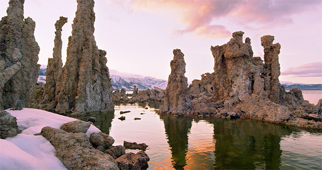
A curve can also be applied separately to each of the red, green and blue color channels, in which case things get more complicated. This is most commonly used to adjust the color balance only for specific tones. For example, one could increase the height of the red curve only for the highlights, which would warm the highlights while preserving the previous color balance for the midtones and shadows:

(to make the highlights warmer)


Note how the red color curve warms highlights in the sky, water and snow without affecting the shadows.
IN PRACTICE
The order in which each setting is applied varies, but it's usually good practice to start with the steps that have the potential to impact the most subsequent steps, or which make those steps easier to visualize. As a general guideline, first specify white balance and check to make sure that the color space and gamma are at their commonly used settings. Then adjust the exposure, shadows, highlights, tones and contrast. Then finally, adjust color saturation and potentially sharpness.

Once you are happy with the grading, the results can be stored as a “look” preset, and easily applied to other clips. The look preset can then be exported to the camera so a DP can view live footage with grading already applied. The preset can also serve as a best guess starting point for subsequent grading on different projects.
After you have a preset, comparing this to intermediate or ungraded settings can help keep oneself grounded and avoid overly aggressive grading. Most sliders default to zero, but any tool can be reset by clicking “M” next to “Reset” in the top right of that tools.
Regardless, optimal grading is usually achieved only by considering the full range of clip content. Although a single frame can be helpful when lighting and subject matter remain consistent, this can also mislead one into improving some portions of the clip at the expense of others. Make sure to scrub through the footage after grading is applied to ensure that it looks as intended throughout.
RELATED TOPICS
- See using white balance to correct color casts for a more in-depth discussion of that tool.
- See RMD files and non-destructive editing to learn about the unique benefits of editing with raw files.